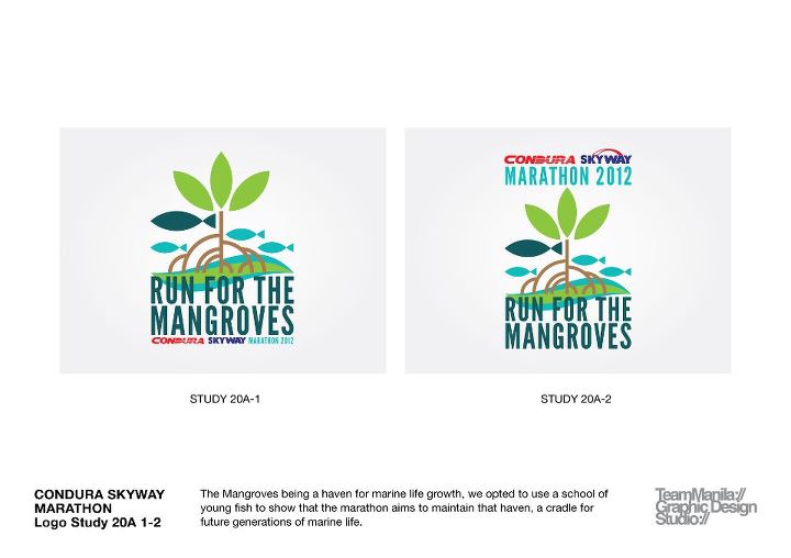
Condura Marathon 2012 is Run for the Mangroves
Posted On October 6, 2011
The theme for the Condura Skyway Marathon 2012 is Run for the Mangroves. Sounds like a good cause again for the Condura Marathon. Here’s a study of the logos for the Condura Marathon 2012 by Team Manila.
Would this look good on the Condura Marathon singlet or finisher’s shirt? What do you think?

22 Comments
picture#1 is cool… gives more emphasis on the mangrove which is the main reason for the run..
design #1 is way better than the other..it’s more pleasing to the eyes..:)
For a finisher’s shirt, I would prefer the #2. I like it when its bears the word “marathon” more prominently.
I agree mas distinct yung #2
#2, but improve “run for the mangroves” text style
#2 is a lot better
#2
I think #1 is quite appropriate.
#2 is my bet
I like the second one for the singlet design. More compact design.
Design # 2 looks more striking – for both the marathon and the cause.
# 2
ung #2 kasi parang nag eendorse ng condura at skyway..ang laki ng panagalan nila…hehehe..peace..
design study 20A-1 is my bet….=)))
#2 for me
#2…but it’s not run for the mangroves per se, Php50 again for their benficiary?! c’mon!
#2 is cooler, MARATHON 2012
study1 is good
#2 for a finisher’s t-shirt
#2 is better
design #1 for the design in front. and then, the text “Condura Skyway Marathon 2012” be the text at the back. OR better yet, put the branding at the bottom of the design # 1, but instead of the whole text in one line, make it 2. ok ba?
…NUMBER TWO…